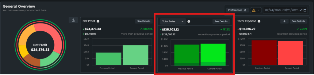
Management Insights: General Overview
The General Overview table provides a summary of both your FBA and FBM sales, along with their total sales amount, within a selected time interval. You can choose the desired timeframe from the drop-down list in the top right corner of the chart, including Yesterday, Last 7 Days, Last 14 Days, Last 30 Days, Last 60 Days, Current Month, Last Month, or a Custom Date Range. This table also allows you to compare your performance with previous time periods.
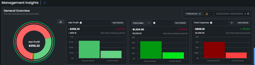
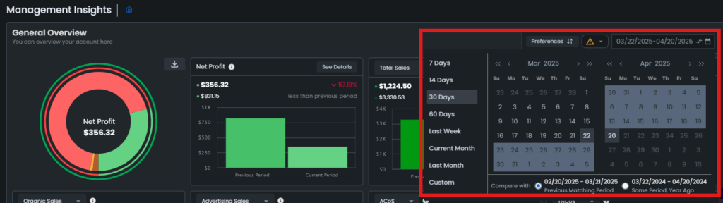
For example, if you select a 30-day interval from the top right section, the table will display Net Profit, Total Sales, and Total Expenses for the last 30 days. Additionally, you will see the percentage change compared to the previous 30-day period.
Now, let’s tackle each graph!
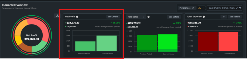
Net Profit
The Net Profit graph shows your calculated profit for a selected period. The calculation of profit is determined by the product costs associated with your SKUs.
Note: It is important to accurately input your product costs to ensure precise profit calculations.
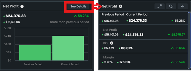
To see the details of the Net Profit graph, click on the See Details button. The card will flip to show the details of the Net Profit.
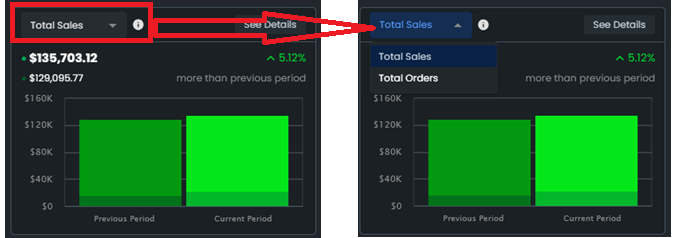
Total Sales/Total Orders
The Total Sales graph shows the amount of ordered product sales with a fulfillment type breakdown. You can decide to include or exclude the shipping amount and reimbursement amount.
The Total Order graph shows the sum of advertising orders and organic orders.
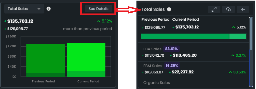
To see the details of the Total Sales graph, click on the See Details button. The card will flip to show the details of the Total Sales.
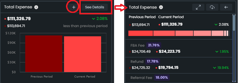
Total Expense
The Total Expense graph shows the expenses, fee, and cost amounts that affect the profitability of the store for a selected period.
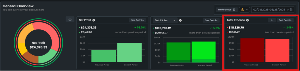
To see the details of the Total Expense graph, click on the See Details button. The card will flip to show the details of the Total Expense. To add a business expense, click on the ‘+’ button.
“Ready to Elevate Your Success? Schedule a call with our experts today – simply click this link and choose a time that works best for you!”