Sales Order Heatmap

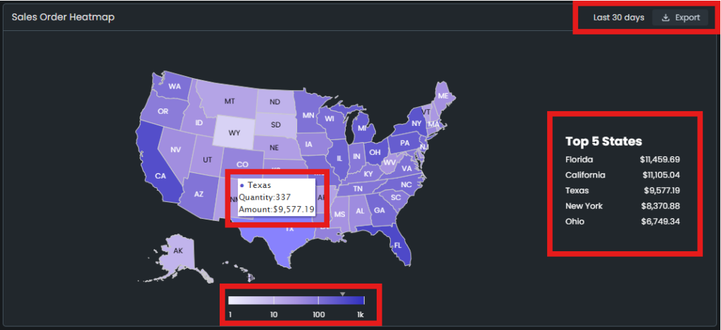
Sales order heatmap illustrates the sales in the last 30 days on state-level for the stores in the US marketplace. This data can be used to guide your decisions regarding local advertising campaigns or warehousing options if you are doing FBM.

The graph uses color representation to illustrate the sales velocity in each state. The darker the color gets, the higher the sales are. It is consistent both on the map and on the scale.

There is a map of the US and also a scale below the map. The scale is dynamic based on the sales data. The scale starts at 1; however, it goes up based on the maximum sales volume. To make it clear, it might go up to 100 or 10,000, even more.

You can see state-specific sales amount and quantity information on the map. To do so, go and hover over a state, and a pop-up text will appear. This text shows the name of the state, sales quantity in units, and the monetary amount of sales. Please see arrow 1 Figure 1 below. Besides, when you hover over one of the states, a marker appears on the scale and shows the quantity sales volume in that state. Please see arrow 2 in Figure 1 below.

Image 72
Figure 1 – State-Specific Data On The Pop-Up Text

On the right side, there is a list of five states where you sell the most in the last 30 days. Please see Figure 2 below.

Image 73
Figure 2 – Top Five States List

Need More Help? Let Our Team Guide You To Success!

Was This Article Helpful?
YesNo

Reach Our Experts Anytime via Chat, We Are Willing to Help You!

Can't find what you need in our Help Documentation? Get in touch with one of our Amazon Experts now!