Sales & Expenses Chart
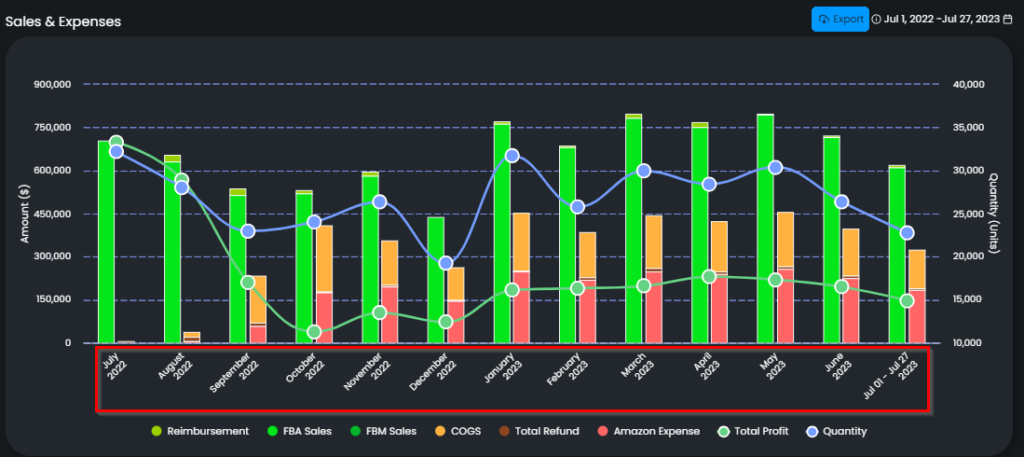
The Sales & Finance chart displays the data of Reimbursement, Total Sales, COGS, Total Refund, Total Expense, Total Profit, Quantity over the last 5 months for resellers and over the 12 months for private labels.
The chart rolls out both categorical and numeric data of the above groups. It is a three-axis chart and you can find the explanations below.
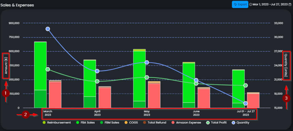
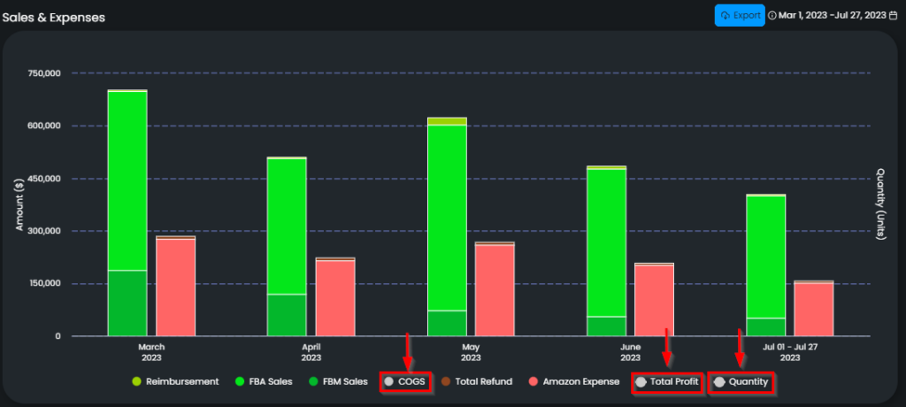
Axis 1: This axis demonstrates the monetary amount in the currency of the marketplace of the store. You can see which currency is in the brackets. Please see arrow 1 in Figure 1 below.
Axis 2: This axis demonstrates the historical data. All these data come on a monthly basis. Please see arrow 2 in Figure 1 below.
Please see Figure 1 to check how historical data on this chart is for the resellers. Please see Figure 2 to check how historical data on this chart is for the private labels.
Axis 3: This axis demonstrates the quantity of information based on units. Please see arrow 3 in Figure 1 below.
Each color represents a specific group on the chart, you can see them with the color balls next to the related group. Please see Figure 3 below.
Reimbursement, Total Sales, COGS, Total Refund, Total Expense, Total Profit are on the bars; whereas, Total Profit and Quantity are on colored lines.
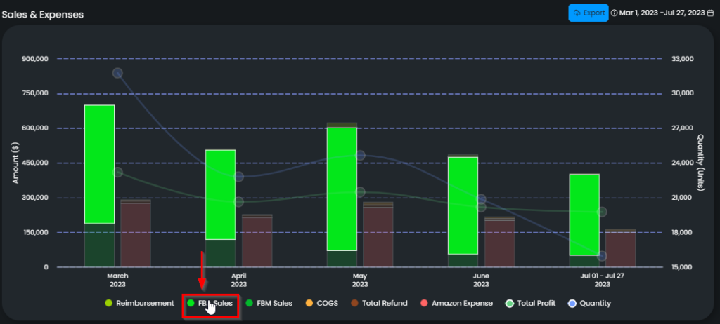
If you want to check a specific group on the chart, go to the related group and hover on the name. Only the data of the related group will be on the chart and the rest will be out of focus. Please see Figure 4 below.
If you want to exclude one or more than one of these groups, go to the related group and click on the group name. The data of the related groups will fade. When you want to include them back into the chart, simply go and click on the group again. Please see Figure 5 below.
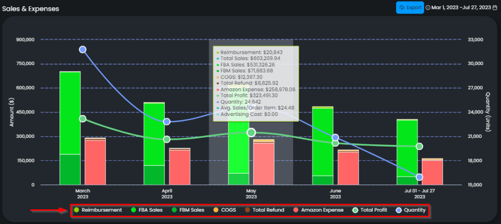
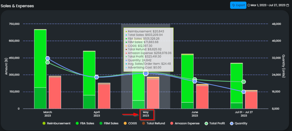
If you want to see the accumulated numerical data of a specific month, go and simply hover on the related month on the chart. A pop-up text will appear, on which you can see the numerical values of each group one by one. Please see Figure 6 below.
In addition, on this pop-up text, there is an average sales value. This value represents the average sales price for one item sold, and the calculation is total sales divided by the quantity.
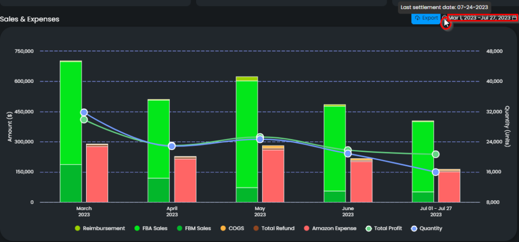
Regarding the update period, on the upper right side of the chart, there is an info icon, when you hover on that, you can see the last date when Amazon provides the Settlement Report for this store. Amazon publishes a ‘Settlement Report’ for each store periodically; and the data of Reimbursement, Total Refund, Total Expense, and Total Profit comes from this report and gets updated every time Amazon publishes this report. However, please note that Total Sales, COGS, and Quantity get updated every day. Please see 1 in Figure 7 below.
The time slot next to the info icon indicates the dates of which data are shown on the chart. Please see 2 in Figure 6 below.
The Sales & Finance Chart is directly related to the Expenses, COGS & Refunds Chart, which gives a deeper insight into the outgoes of a specific month. Clicking on the related month on the bar chart will redirect you to the related Expenses, COGS & Refunds Chart.